on August 08, 2025
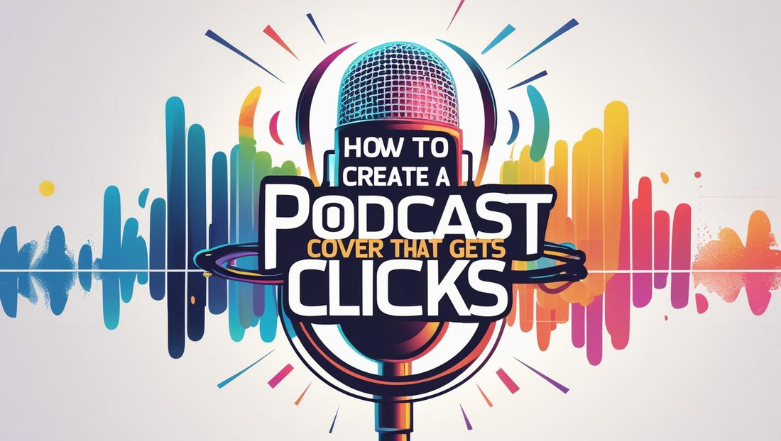
Your podcast cover is often the first thing a potential listener sees — and in a crowded feed, you only have a split second to grab their attention. A great podcast cover can spark curiosity, communicate your show’s personality, and convince someone to click “Play.”
In this guide, you’ll learn the essential steps to creating a podcast cover that stands out, builds your brand, and gets clicks.

Why Your Podcast Cover Matters
In podcast apps like Apple Podcasts and Spotify, your cover acts like a visual billboard. It influences:
- First impressions – A polished design signals professionalism.
- Brand recognition – Consistent colors, fonts, and imagery help listeners remember you.
- Click-through rates – Eye-catching art encourages browsing listeners to click.
And since most podcast directories display cover art at small sizes, your design must look great both big and tiny.
Step 1: Follow Platform Requirements
Before diving into design, make sure your cover meets the technical specs:
- Size: Minimum 1400 x 1400 pixels, maximum 3000 x 3000 pixels.
- Format: JPEG or PNG.
- Color Mode: RGB.
- File Size: Under 500KB for Apple Podcasts.
Following these standards ensures your cover looks crisp and loads quickly across all platforms.
Step 2: Keep It Simple and Bold
When shrunk down on a phone screen, detailed designs can become a blur. Instead:
- Use one central image or icon.
- Keep text short — ideally your podcast title only.
- Use high-contrast colors to stand out in dark mode and light mode.
- Avoid clutter or small decorative elements.
Think of your cover as a tiny ad for your show — bold, clear, and instantly recognizable.
Step 3: Choose the Right Typography
Fonts can convey a lot about your show’s tone:
- Sans-serif fonts feel modern and clean.
- Serif fonts can feel more traditional or sophisticated.
- Handwritten or script fonts give a personal, casual vibe.
Whatever you choose, make sure it’s legible at thumbnail size. Avoid over-stylized fonts that are hard to read.
Step 4: Pick Colors That Pop
Color psychology plays a big role in click appeal:
- Bright colors like yellow and orange convey energy and positivity.
- Blues suggest trust and professionalism.
- Bold contrasts make elements stand out.
Also, consider how your colors will appear against different app backgrounds — Spotify’s dark theme vs. Apple’s light theme, for example
